
Overall, I am pretty happy with the Twenty Seventeen theme that ships with WordPress, but one thing that really drives me crazy is that whatever cover image you upload takes up nearly 100% of the entire web browser when viewing on a desktop or laptop. I find it darn near infuriating, because I have to scroll down just to click on a menu link or see content. That ain’t right.
I mean, just look at this:
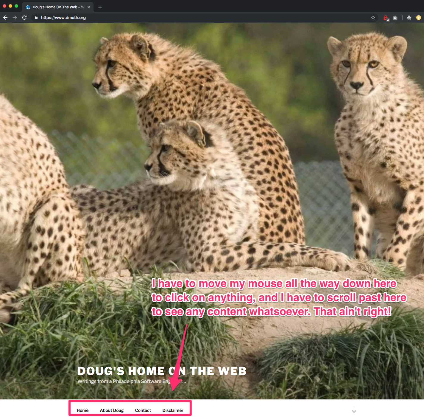
We can do better.
I fired up the console in Chrome and started inspecting elements, and found two places where CSS can be modified to adjust the height of the image on both desktop and mobile renderings. Simply go into Themes -> Customize -> Additional CSS and add this:
.twentyseventeen-front-page.has-header-image .custom-header-media, .twentyseventeen-front-page.has-header-video .custom-header-media, .home.blog.has-header-image .custom-header-media, .home.blog.has-header-video .custom-header-media {
    height: 40vh;
}

.has-header-image.twentyseventeen-front-page .custom-header, .has-header-video.twentyseventeen-front-page .custom-header, .has-header-image.home.blog .custom-header, .has-header-video.home.blog .custom-header {
    height: 40vh;
}
You’ll be able to see it in the preview, and as soon as you click “Publish”, the new CSS will go out, and your homepage will look like this:
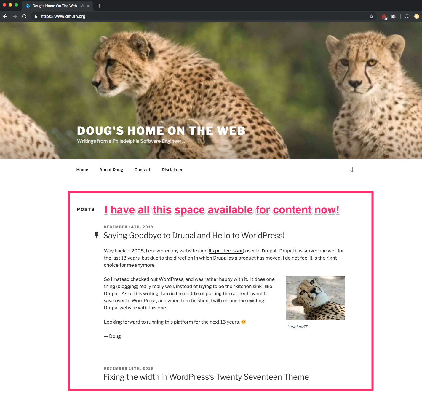
What a thing of beauty.